1. One display and one text family
Two font families are enough. Consistency and clear weights create hierarchy.
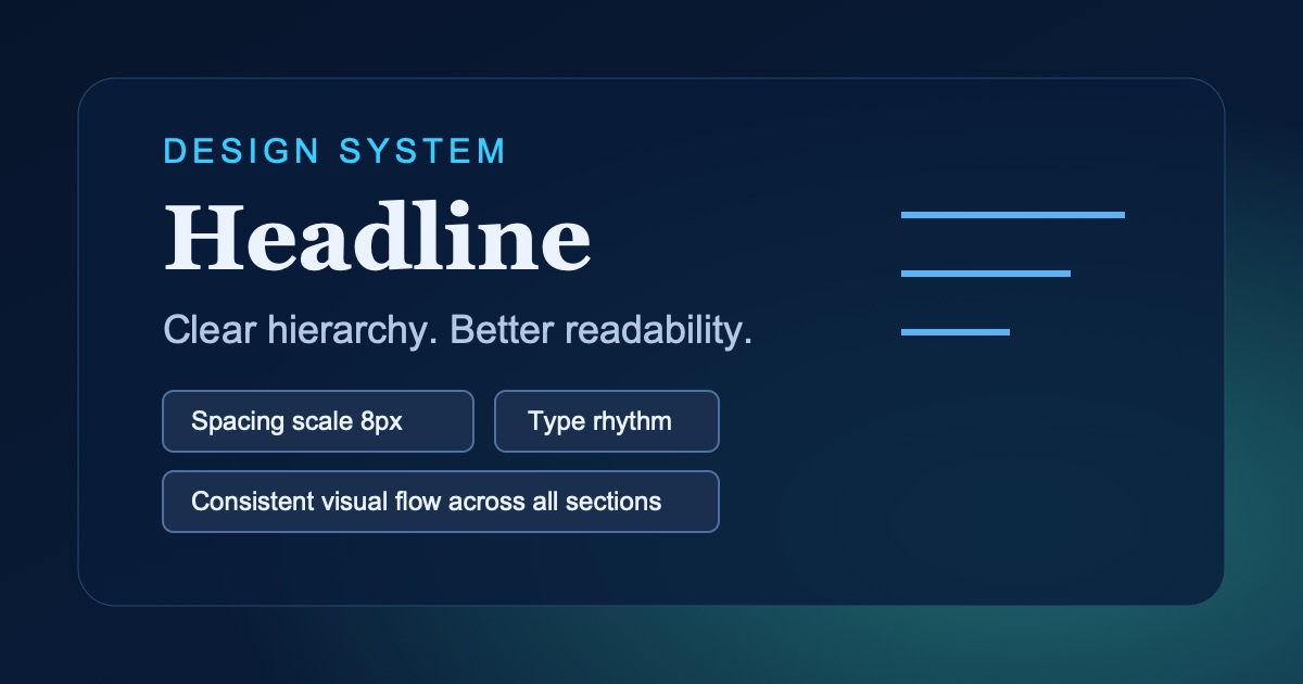
2. Spacing as a system
Use a 4–8px rhythm. It gives order without constant decisions.
3. Short copy, clear message
A corporate website must explain value quickly. Each block should have a single goal.